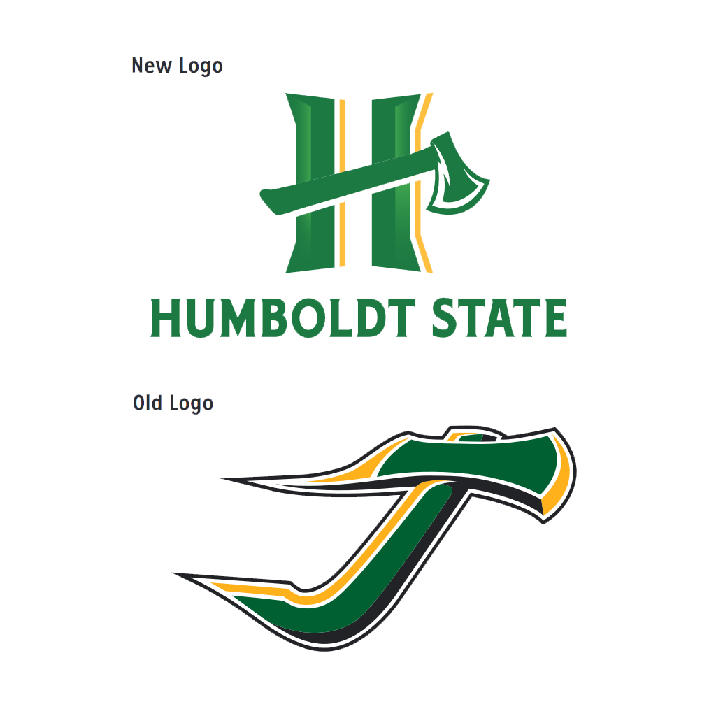
HSU athletics unveiled a new branding and website on April 7, ushering in a new era for athletics. Humboldt State has moved away from the long used “Flying J” and into the new “Spirit H”.
The fresh logo comes after a year-long rebranding process with a few halts due to the pandemic. However, the logo and rebranding has finally been completed and looks to be a part of HSU’s foreseeable future. The “Spirit H” will be worn on jerseys, gear, and even the HSU Lumberjack Arena floor.
In a statement given by Athletic Director and Club Sports Director Jane Teixeira, the new logo will represent a community larger than just Humboldt State.
“The new logo represents a bolder identity for HSU athletics,” Teixeira said. “It encompasses the pride of the Humboldt community and the excellence we focus on as a department and as an institution. Even though we started the logo process a while ago, sharing it with the community feels even more special after the challenges of the past year. I’m excited for the future and grateful to the University and to those who led the way on the creation of the new logo.”
Gou Nitta, a sophomore and Humboldt State soccer player, is excited as a student athlete to be part of the new branding for athletics.
“I think it is a cool design,” Nitta said. “It looks a lot different from the logo before and I’d say that it represents Humboldt State very well with the big “H” holding an axe.”
Nitta believes that HSU athletics will finally be able to stand out against the competition as well.
“I think it is going to be easier to tell from the logo that it is Humboldt State you’re playing,” Nitta said.
The new branding of Humboldt State athletics entails a new era for the school. This new branding looks towards the future of HSU athletics. The logo is a homage to the past, implementing a lightning bolt on the blade of the axe in reference to the schools original team name, the Tunderbolts, while also looking towards the future.

Leave a Reply